Monthly Archives: January 2013

Math talk at Davos

Davos’ jet-setters are tossing around a math term, Felix Salmon reports:

This year’s Davos was all about tail risk — or, more to the point, the absence thereof. The ECB’s Mario Draghi said — more than once — that he had “removed the tail risk from the euro”. His colleague Ignazio Visco went almost as far, saying that only a few tail risks remain.

[Felix lists a few more examples. . .]

And that was just the on-the-record comments: off the record, many more people, including at least one official US representative, were saying the same thing.

Felix ably explains how they don’t know what they are talking about.

[H]ere’s what none of them seem to understand: tail risks, by definition, can’t be measured. If you can look at a certain risk and determine that it has gone down, then it’s not a tail risk: it’s something else. Let’s say that last year there was a 25% chance that Greece would leave the euro: if something has a 25% chance of happening, it’s not a tail risk any more, it’s just a risk.

If you’re planning a trip to the Grand Canyon, you might think about buying travel insurance to cover yourself in the event you are seriously injured. But when you’re right up at the edge of the canyon and the ground starts slipping beneath your feet, at that point you have to actually do something to avoid injury or death. The risk has gone from being theoretical to being real — and at that point it’s not a tail risk any more, it’s a real possibility with a scarily high probability.

In fairness to the leaders of the world, they’re trying to avoid another financial catastrophe like 2008. But the global financial meltdown wasn’t really tail risk. Back then, more than a few worried that weak lending practices could trigger global calamity – including the World Economic Forum, circa 2008.

A better example of tail risk would be the 2011 New Zealand earthquakes, which occurred on fault lines no one knew existed. And it shows the futility of trying to reduce a specific tail risk. Each tail risk is so unlikely, you’d waste time and money trying to alleviate it. You just have to be aware that something you never considered is going to happen, and you need enough flexibility (read: capital) to address that thing when it happens.
Whither rates?

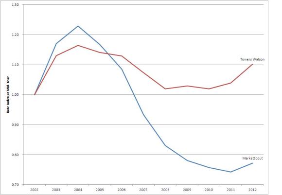
Been noodling around with rate indices this morning and came up with this chart:

rate index

As you doubtless know, there are several free indices that follow property-casualty rates. (Wrote about several here.) I’ve picked out two, Towers Watson’s CLIPS and the MarketScout Barometer, and created an index off their mid-year rates.

Both show rates climbing through 2004, then falling till 2010 or so, then climbing. MarketScout shows much sharper swings, in both directions. Which of these you believe should drive your attitude toward the current p/c market.

Opinions differ on this, of course, but I feel much more comfortable with the P.O.V. Towers puts forth. First, from my research, I believe CLIPS is more reliable – it standardizes the rate indices from several companies. The individual companies have a stake in getting their own numbers right; Towers is able to leverage off that need.

MarketScout’s rate changes are built from information received from independent retail agents, supplemented by a survey. Rates are collected on an “apples-to-apples” basis – averting a common pitfall – but I personally believe the index fluctuates more than the market. When rates are rising, I think MarketScout overstates the increase, and when they are falling, I think it overstates the decrease.

So where are commercial rates headed in 2013? The Towers survey indicates that rates are about 10% higher than in 2002. Whether that’s adequate depends on your view of frequency and severity trend. In any case, you wouldn’t expect a “traditional” hard market – increases of 15% or more – anytime soon.

The MarketScout Barometer shows rates are 20% lower than they were in 2002. If you believe that, then you would anticipate a steep spike in rates some time in the next couple of years.

I guess that shows where my money is.

Driverless cars – no rush, no worries

My buddy DW jumps on the driverless car meme:

Everyone’s fired up again. This time, however, the debate is moving in a direction that I can relate to. Here’ Megan McArdle (who has obviously been catching up on my blog archive):

Now I’m gloomy again.

Why? Not because of the technology. And not because of the regulation.  But because of the liability.  Self-driving cars represent a massive one–one that I’m not sure companies will take on.

Now, luckily, as many others are observing, a crazy tort system is somewhat unique here in the US and driverless cars need not multiply in the land of their birth.

My guess would be that promising-but-scary technology is more likely to be pioneered in a poorer country, since as people get wealthier they tend to become more risk averse and prioritize safety. But if something proves really useful and basically safe in some subset of countries, the pressure to change the rules elsewhere should become intense.

Good luck to Singapore or wherever but tweak US tort law? It is hard to describe how immense a task that is.

I’m not worried about the liability issue at all.

First, the technology will not emerge full-born onto all aspects of driving simultaneously. The first step will be adjustable cruise control, where the car automatically adjusts its speed according to what it sees in front of it. That’s coming soon, or maybe it’s already here and I missed it.

Megan McArdle envisions a later problem: a driverless car wandering a leafy suburb and failing to recognize that when a big red ball bounces into the street, a toddler is bound to follow.

But that is one of the last pieces of the technology we’ll see. And she envisions it going on the road when it doesn’t work properly. Why on earth would that happen? Does she think her scenario hasn’t occurred to – oh – every single person who contemplates a driverless car?

It may help to consider how big a blind spot Megan has constructed.

  • She assumes the scientists working on the project haven’t thought of her scenario.
  • She assumes the managers of the project haven’t thought of it.
  • She assumes Google’s risk management team hasn’t thought of it.
  • She assumes Google’s insurers haven’t thought of it.
  • She assumes Google’s CEO hasn’t thought of it.
  • She assumes that Google’s investors haven’t thought of it.
  • She assumes that not a single regulator involved in licensing vehicles has thought of it.

This is the Smart Man Trap, and Megan has fallen into it. Because Megan is bright, she thinks of things that most people don’t. Therefore, she assumes she has thought of something that no one else has. That’s the trap – being smarter than every individual doesn’t mean you are smarter than the collected wisdom of all those individuals.

More likely liability issues would emerge from a chain of, say, 100 cars that cruise off the interstate and into, say, a shopping center. Lots of dead people and significant property damage. However, that loss is akin to the crash of a jetliner – tragic, yes, but insurable.

And I bet Google has a plan to deal with that, likely involving disclaimers, insurance and lobbyists.

What’s in a name?

From the New York Times:

On March 16, 2007, Morgan Stanley employees working on one of the toxic assets that helped blow up the world economy discussed what to name it. Among the team members’ suggestions: “Subprime Meltdown,” “Hitman,” “Nuclear Holocaust” and “Mike Tyson’s Punchout,” as well a simple yet direct reference to a bag of excrement.

And the Morgan Stanley denial:

“While the e-mail in question contains inappropriate language and reflects a poor attempt at humor, the Morgan Stanley employee who wrote it was responsible for documenting transactions. It was not his job or within his skill set to assess the state of the market or the credit quality of the transaction being discussed.”

Careful with the jokes, folks.

Growth in shareholder funds

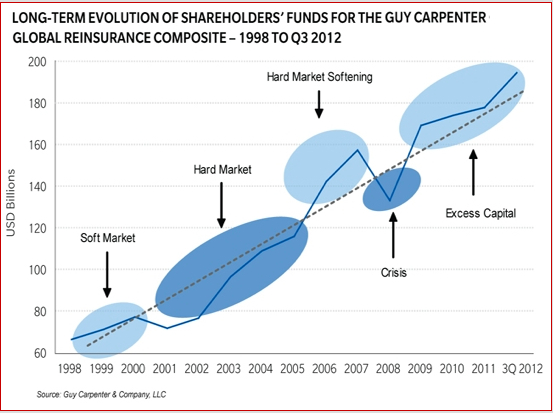
I find this Guy Carpenter chart interesting:

gc shareholder fundsPeriods are highlighted when overall capital is above or below the trend line.

The light blue ovals denote periods of excess capital. The dark blue denote periods of inadequate capital.

I’m not sure of any takeaway, except to note that capital excess and shortage do not, by itself, drive the market. The 2008-2009 period (labeled “Crisis”) did not drive a hard market, nor did the 1998-2000 period.

Personally, I believe what constitutes a hard market has changed, and we’re in one now.¹ And of course, according to this chart, we’re in a period of excess capital.

——–

¹ Prices are rising mildly – in the 5% range – and I suggest that such increases are the new normal for a hard market, because the industry has gotten so much better at tracking rate and exposure. I hasten to add that a lot of smart people – namely, just about everyone in the industry – disagrees.

PCS raises Sandy estimate to $18.75B

This is a fairly important development, as Property Claim Services’ estimates drive recoveries in the cat bond market. Also important: The new estimate is about $7B higher than the old one, and it syncs better with estimates from the hurricane modelers.

As our friends at Artemis point out, a number of insurance-linked securities have triggers in the $20B to $25B range.

Artemis also has a thorough listing of Sandy losses by insurer, and the site points out that the sum of insurer reports is very close to the PCS estimate.

7 a.m. Monday morning

Attended the Property/Casualty Insurance Joint Industry Forum, last week in New York. I found these tidbits lying about.

Here’s a couple of interesting thoughts from the meeting:

  • V.J. Dowling, managing partner, Dowling and Partners: Before financial crisis, p/c insurers traded below book value exactly one month – March 2000 – height of the dot-com boom. Since financial crisis, p/c insurers traded ABOVE book value exactly one month.
  • Brian Sullivan, editor, Risk Information Inc.: Were Progressive’s Snapshot a standalone company, it would be the 20th largest auto insurer in the United States.
  • Mike McGavick, CEO of XL, likened Solvency II to “an overbuilt airplane trying to take off. As it has trouble, they keep adding runway.” Instead, he said, regulators should “look at the airplane” and whether it needs rebuilding.


More guns, more homicide? Or maybe less?

Let me begin by saying I’m not trying to make a point about gun control. I want to show what happens when you infer a linear relationship where one probably doesn’t exist.

Via Facebook, I got a link to this article by gun control opponent John Lott. The headline sums up his argument: “More Guns = More Murders? A Myth. More Guns = Fewer Murders”

Here’s a snippet:

. . . [T]he New York Times earlier this month put forward the notion: “Generally, if you live in a civilized society, more guns mean more death.” The claim is all over the news from CNN to various “Fact Check” articles.
It would be nice if things were that simple.

The evidence — and there is plenty of it — points to the very opposite, that cutting access to guns mainly disarms law-abiding citizens, making criminals’ lives easier. Guns let potential victims defend themselves when the police aren’t there.

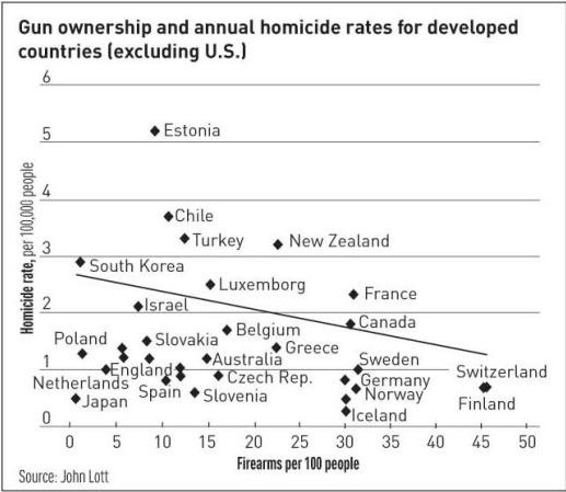
In his article Lott’s evidence is the chart you see here.

lott

Countries like Switzerland and Finland, at the bottom right, have lots of firearms per 100 residents, with low homicide rates. And Estonia, way at the top, has a fairly low firearm ownership rate, but a high homicide rate. The line is a fitted regression of the underlying data. It slopes downward, leading Lott to conclude that the more firearms you have, the fewer homicides.

But that regression line didn’t look right to me, mainly because there are only eight data points above the line, while there are 23 below the line. So I tried to reproduce the chart. I don’t have the underlying data, so I interpolated the points on Lott’s chart. (There’s software that does this, but I don’t have a copy.

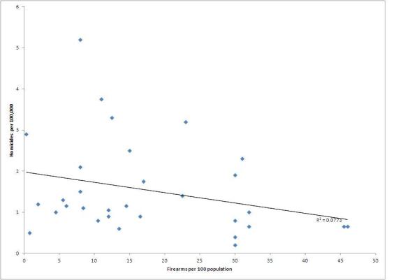
My version is what you see below:

lott reproducedThis looks pretty close, to my eye, to the original chart.

I’ve also included the R-square value, 0.0773.  Of course, that’s a poor fit for the data. Speaking loosely, it says that handgun density only predicts about 8% of the murder rate.

There’s really not a linear relationship here, and I think Lott is being a bit disingenuous suggesting there is one.

Then I got curious about the title of Lott’s chart, “Gun ownership and annual homicide rates for developed countries (excluding US).” He was writing an editorial about owning guns in the United States. Why would he leave out data regarding the United States?

I got information on homicide rates here – about 4.8 homicides per 100,000 population. It got gun ownership information here – about 90 firearms per 100 persons.

I’ll acknowledge up front my data point may cover a different year than Lott has modeled. And there may be a mismatch between my two sources. But both are consistent with what I’ve read elsewhere. I’m aware of no trends that would cause my estimate to be significantly off the mark.

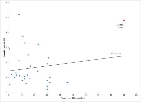
Inserting a U.S. data point yields the following graph:

lott with USThis chart doesn’t look much like the others, mainly because the United States has gun ownership far, far higher than the other countries and has the second highest homicide rate, behind Estonia.

When you include the United States, the slope of the line changes. Now the regression indicates that the more handguns per capita, the higher the homicide rate.

But note the R-square: 0.0255. (So that handgun prevalence only explains 2.5% of the homicide rate.) That’s a worse fit than before.

Realistically, you can’t conclude, based on this data that handguns lead to more crime, or less.

I’m not trying to persuade anyone in any direction on this issue. And I’m sure there are stronger cases to be made on either side.

However, Lott disserves the reader and his cause by relying on this data to make his case.

Incidentally, a much better analysis appears here. (I found it when I was wrapping this post up.) The author appears to be working with the same data Lott worked with. He incorporates a couple of other variables, like income inequality, and reaches a similar conclusion to mine.

1-in-100 cat forecast: $200B

Via Bob Bear, I see AIR calls the 2011 year cat losses, in essence, bad but not that unusual.

In case the fog of that year hasn’t quite lifted: Earthquakes in Japan and New Zealand, tornadoes in the United States, a hurricane in Australia, floods in Thailand caused $110B in insured losses. Oh, and there was a tsunami.

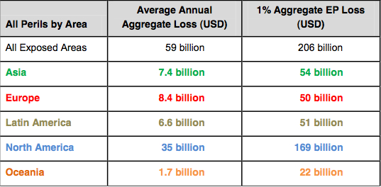
But by AIR’s reckoning, 2011 is a 1-in-15 year (exceedence probability 6.7%). One year in 100, the cat modeling firm says in this report, expect $206B in cat losses. The average annual aggregate loss is $59B worldwide.

I emphasize these are annual losses, not losses from a single occurrence, and that the loss estimates are worldwide.

But AIR gives this table, which models industry losses worldwide and by region:

AIR table Pretty clear the heavy exposure is in North America, particularly the United States.

To cheer you a bit more, AIR pulls up three loss scenarios that hit the 1% worldwide aggregate.

Scenario 1 is what you’d expect – the big storm hits Florida. In fact it hits Miami and Tampa, oozes into the Gulf then returns to traverse the state west-to-east, going back into the Atlantic near Cape Canaveral. That one sets the industry back $158B, in AIR’s estimation.

That same year, Houston/Galveston gets hit with an $11B storm. Worldwide miscellany take the annual toll above $200B.

Scenario 2 includes a less nasty Florida hurricane (just $78B), a more nasty Texas hurricane ($34B), a monster European winter storm ($14B) and a $10B UK flood. Other unpleasantries bring the annual total above $200B.

And Scenario 3: The big quake hits Tokyo ($114B), another quake hits Chile ($35B), and a third strikes Turkey ($14B). Again some (relatively) small stuff makes up the remainder.

What’s this?

Image

Last week I met a gentleman with one of these bad boys. He had no calculator on his desk, at least that I could see.

We had a brief, but fascinating conversation. First off, I learned that I need to point out, for the benefit of most readers, this is a picture of a slide rule. Before pocket calculators (which became popular in the 1970s), mathematicians, engineers, etc., used slide rules to multiply, divide, calculate exponentials and work trig functions. Continue reading